📊 Data Profession Survey Dashboard (Power BI)
View on GitHub📋 Overview
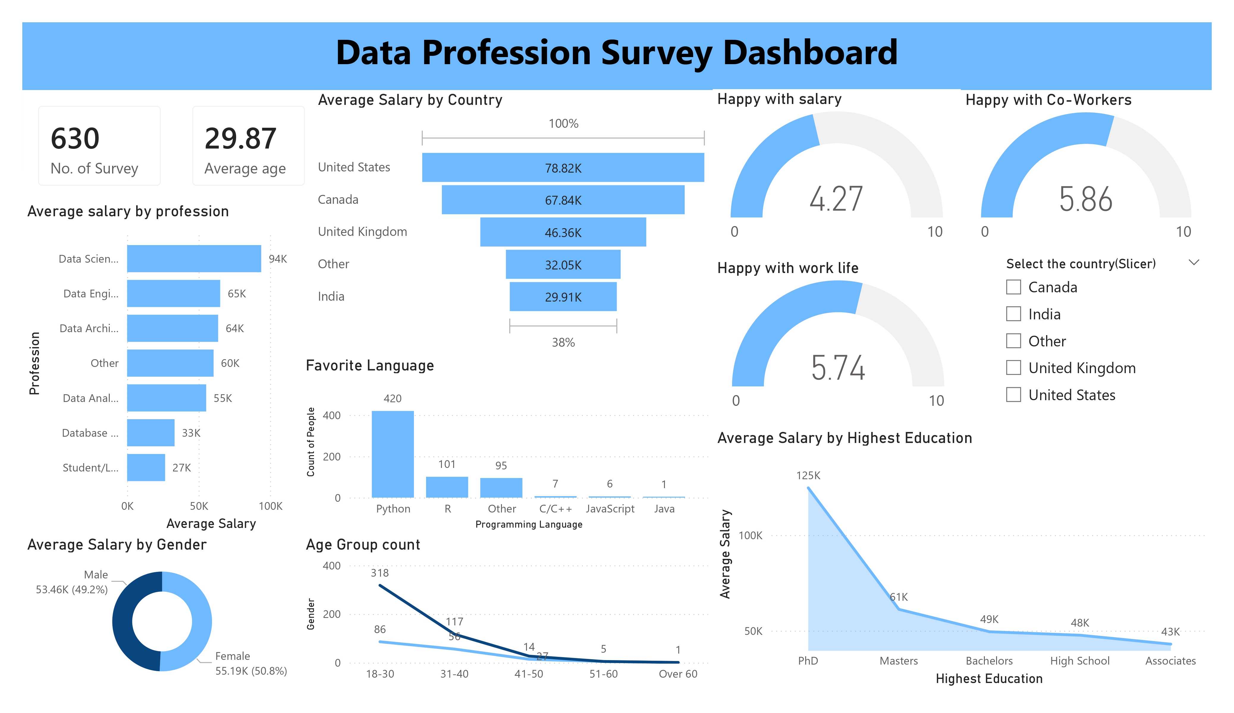
This project presents an interactive Power BI dashboard analyzing survey data from data professionals
across salary trends, demographics, education levels, job satisfaction, and programming preferences.
The dashboard transforms raw survey responses into meaningful business insights through data cleaning,
transformation, KPI tracking, and interactive visual storytelling.
✨ Key Insights
💰 Salary Analysis
- Compared salary trends across professions, countries, and education levels
- Identified top-paying data roles and compensation patterns
👥 Demographic Insights
- Analyzed age groups, gender distribution, and respondent demographics
- Explored workforce composition trends
😊 Satisfaction Analysis
- Measured salary satisfaction, work-life balance, and co-worker satisfaction
- Highlighted sentiment patterns among respondents
💻 Technology Preferences
- Analyzed favorite programming language preferences
- Identified dominant technology trends among professionals
📊 Interactive Dashboarding
- Built slicers and dynamic filtering for country-wise analysis
- Enabled interactive exploration of survey metrics
🧹 Data Cleaning & Transformation
- Removed unused columns and standardized inconsistent survey responses
- Converted salary ranges into average numeric values for analysis